Encore: Sales Data Interface Redesign
Role
UX/UI Designer
Methods & Tools
User Research, Interviews, Wireframing, Prototyping, Usability Testing, Figma, Zoom, Design System, User-Centered Design
Duration
June 2024 - Present
The Encore sales data interface was initially designed to support real estate sales teams in tracking units sold, income generated, and managing customer profiles. However, user feedback revealed challenges with navigating the interface and interpreting data, impacting the sales team’s productivity. My goal was to redesign the interface to improve data visibility, streamline user interactions, and create an intuitive layout that supports informed decision-making.
Problem Statement
The original Encore interface lacked clear data visualization and had a cluttered layout, making it difficult for users to access relevant sales metrics efficiently. Key issues included: • Difficulty in quickly assessing monthly sales performance. • Inefficient navigation for managing client and booking information. • Lack of visual hierarchy, causing information overload. • Lack of Brand Identity.
Research and Insights
To gain a deeper understanding of user needs, I conducted structured interviews with sales representatives and team managers, focusing on their daily workflows, pain points, and specific data requirements. This process revealed several key insights:
Emphasis on Visual Data Representation: Users expressed a strong preference for visual aids, such as graphs, progress indicators, and color-coded status markers, to interpret sales data quickly and efficiently. They wanted to avoid manually interpreting complex tables, especially for comparing monthly sales performance and tracking cumulative income trends.
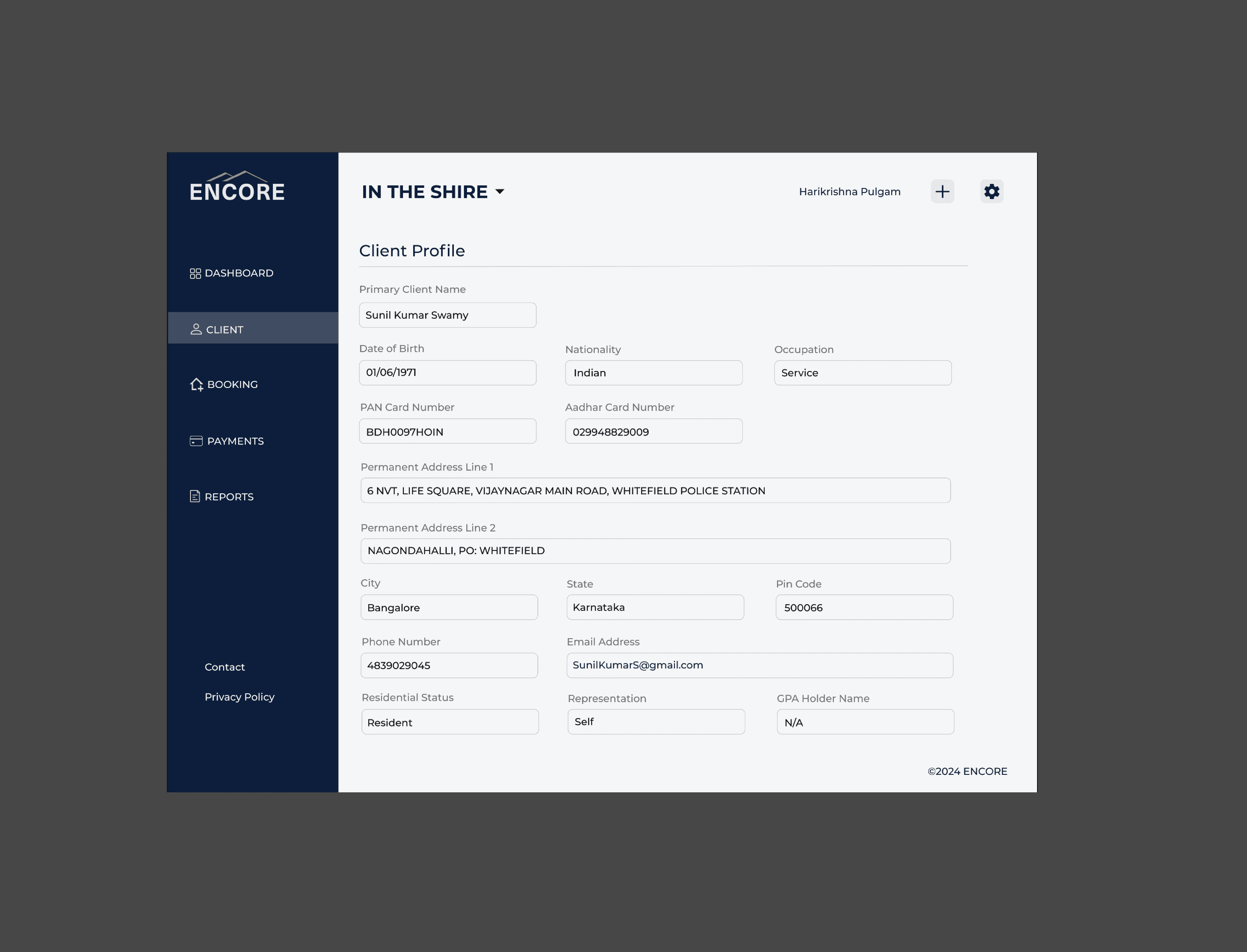
Quick Access to High-Frequency Tasks: Sales reps frequently needed to access client profiles, booking details, and payment status. The previous design required multiple clicks, which interrupted their workflow. They emphasized the need for a streamlined navigation structure that would allow them to reach these key sections with minimal effort, ideally from a single dashboard view.
Customization of Data Views: Different team members had varying data priorities based on their roles. Managers wanted a high-level overview of sales and revenue trends, while sales reps needed detailed views of individual units and client information. This led to the realization that customizable filters (e.g., by unit type, sale status, or region) were essential, allowing users to tailor their data view according to their specific responsibilities.
Clarity in Data Hierarchy: Users found that the original layout lacked a clear hierarchy, making it challenging to differentiate between primary and secondary information. They expressed a need for a visual hierarchy that prioritizes high-impact metrics, such as total sales, income, and unit status, while keeping less critical details accessible but not overwhelming.
Design Process
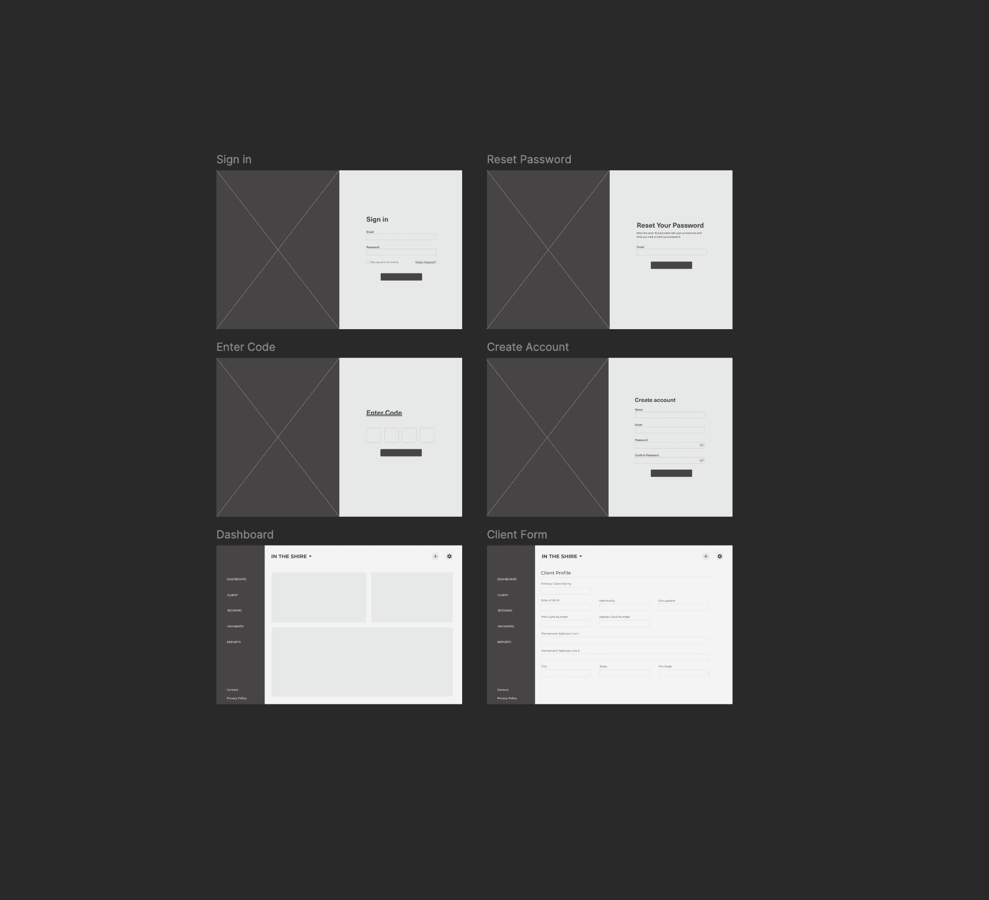
Wireframing: I Started with low-fidelity wireframes to establish a clear layout that prioritized essential metrics and streamlined navigation. Key features included a sidebar for primary functions and a data dashboard to consolidate sales information.
Prototyping & User Flows: I Created mid-fidelity prototypes in Figma, integrating visual elements like graphs for units sold, income tracking, and progress bars for sales completion. Defined user flows for common tasks, including client profile searches and sales data filtering.
Usability Testing: I Conducted usability testing sessions with sales team members. Key feedback included:
Positive Response to Visual Data: Users found graphs and progress indicators extremely helpful for quick insights into sales trends and unit statuses.
Enhanced Navigation Experience: The sidebar layout was well-received, as it allowed users to access frequently used sections quickly.
Demand for Filter Options: Users appreciated the added filter functionality, which allowed them to tailor the view to their specific needs.
Final Design
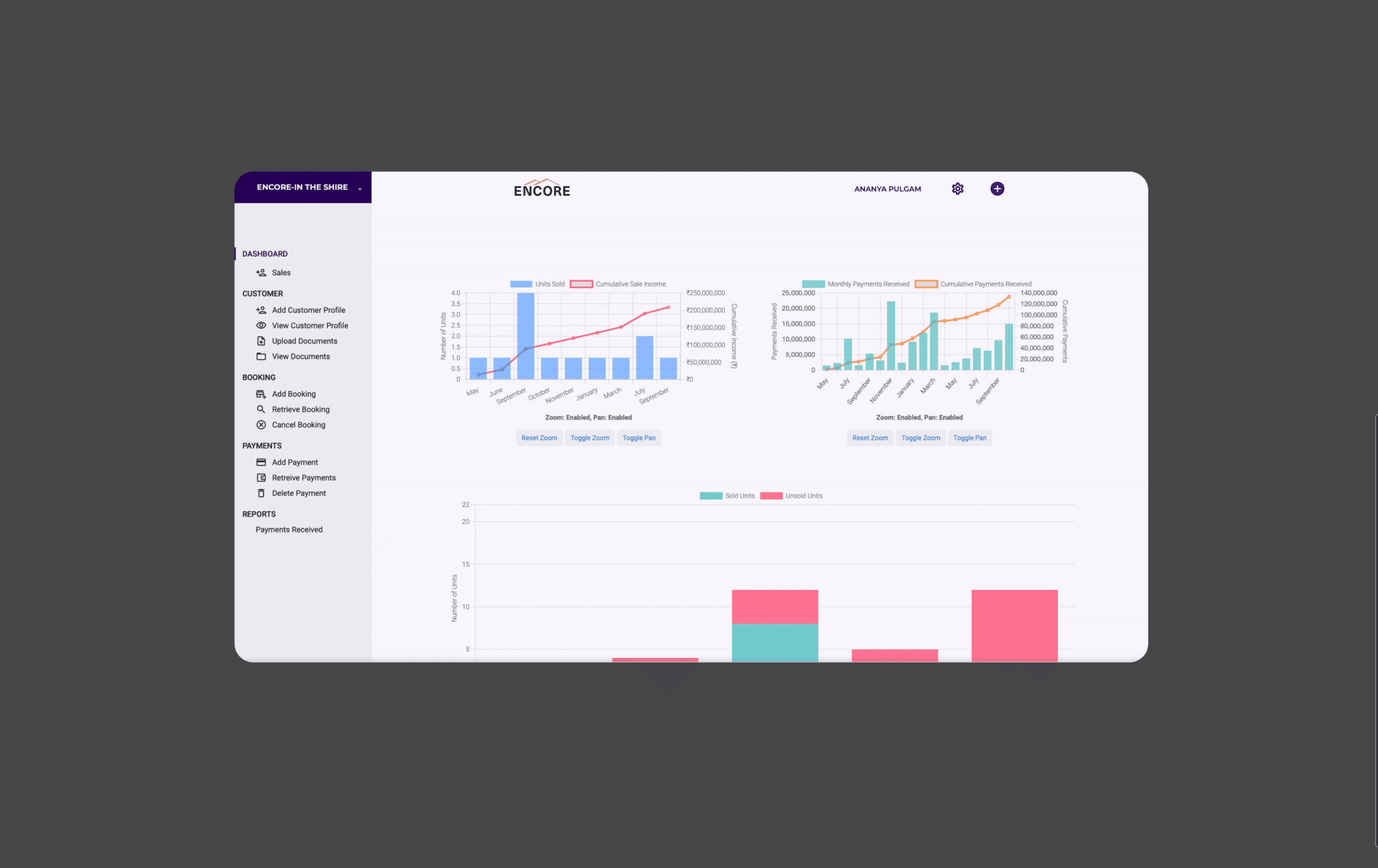
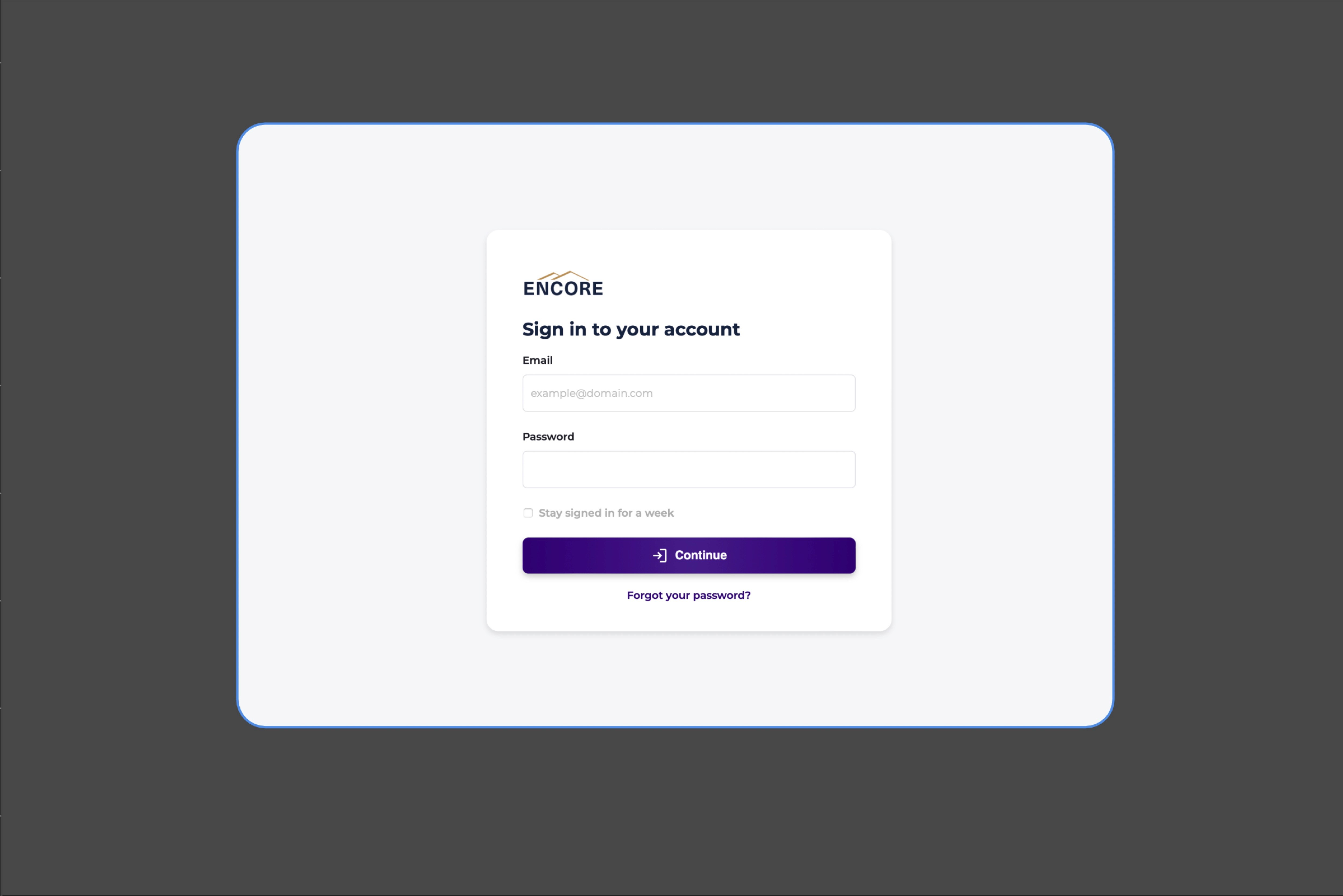
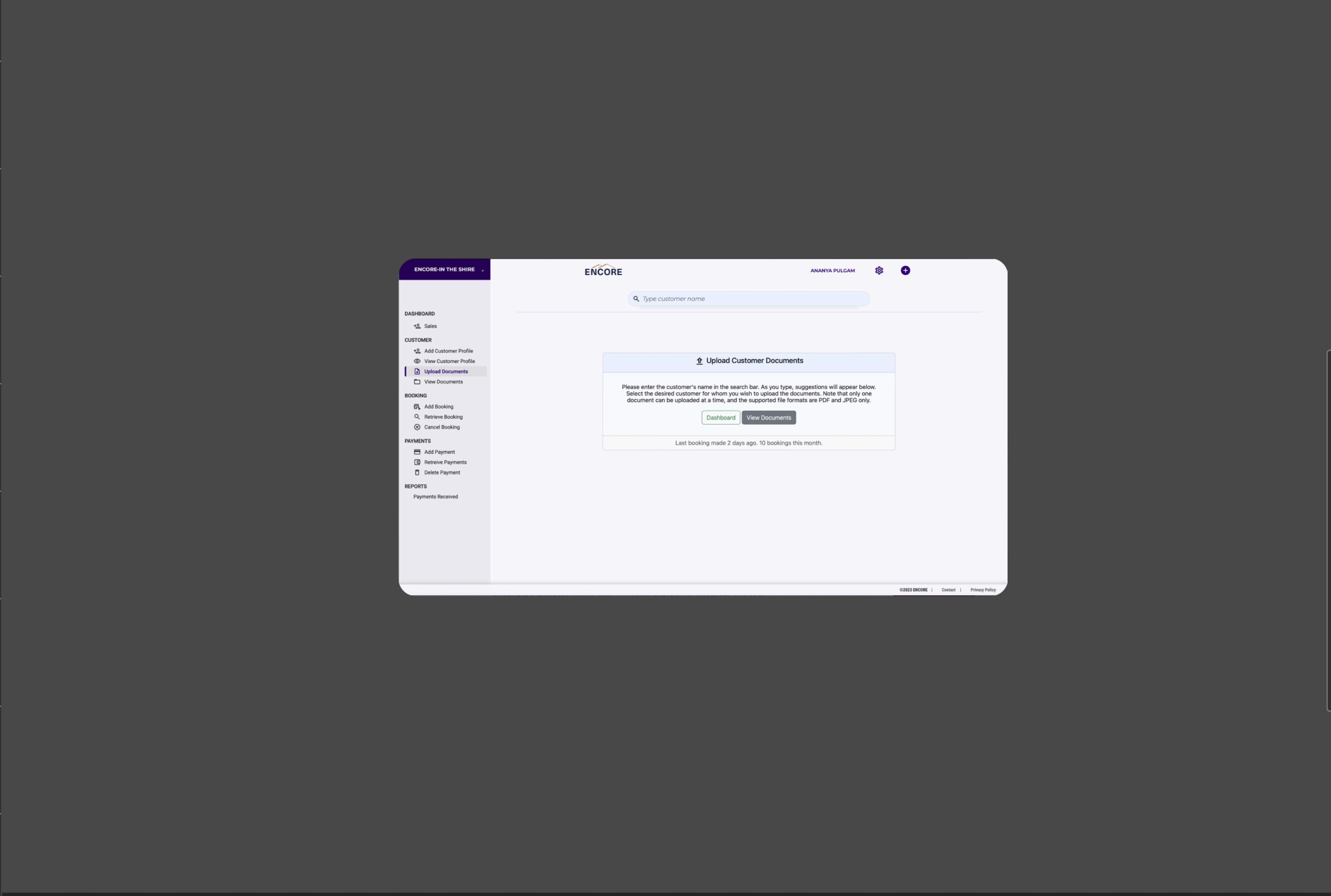
The final interface design focused on a clean, user-friendly layout with prominent visualizations. Key components included:
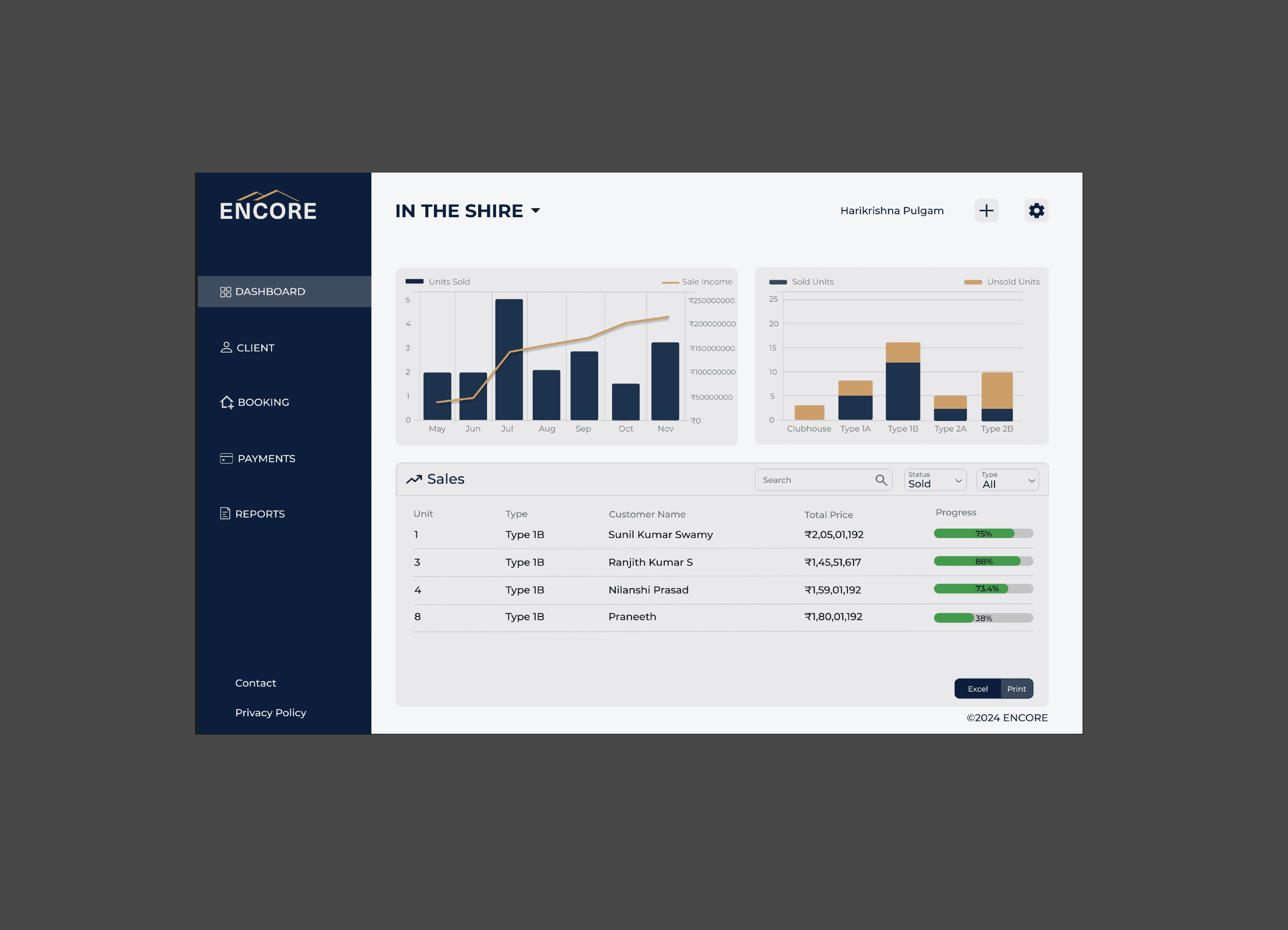
Dashboard with Data Visualizations: A dynamic dashboard with monthly sales and unit-type graphs provided users with a quick overview of sales trends and income.
Progress Tracking for Sales: Each unit in the sales table displayed a progress bar, allowing reps to monitor deal status at a glance.
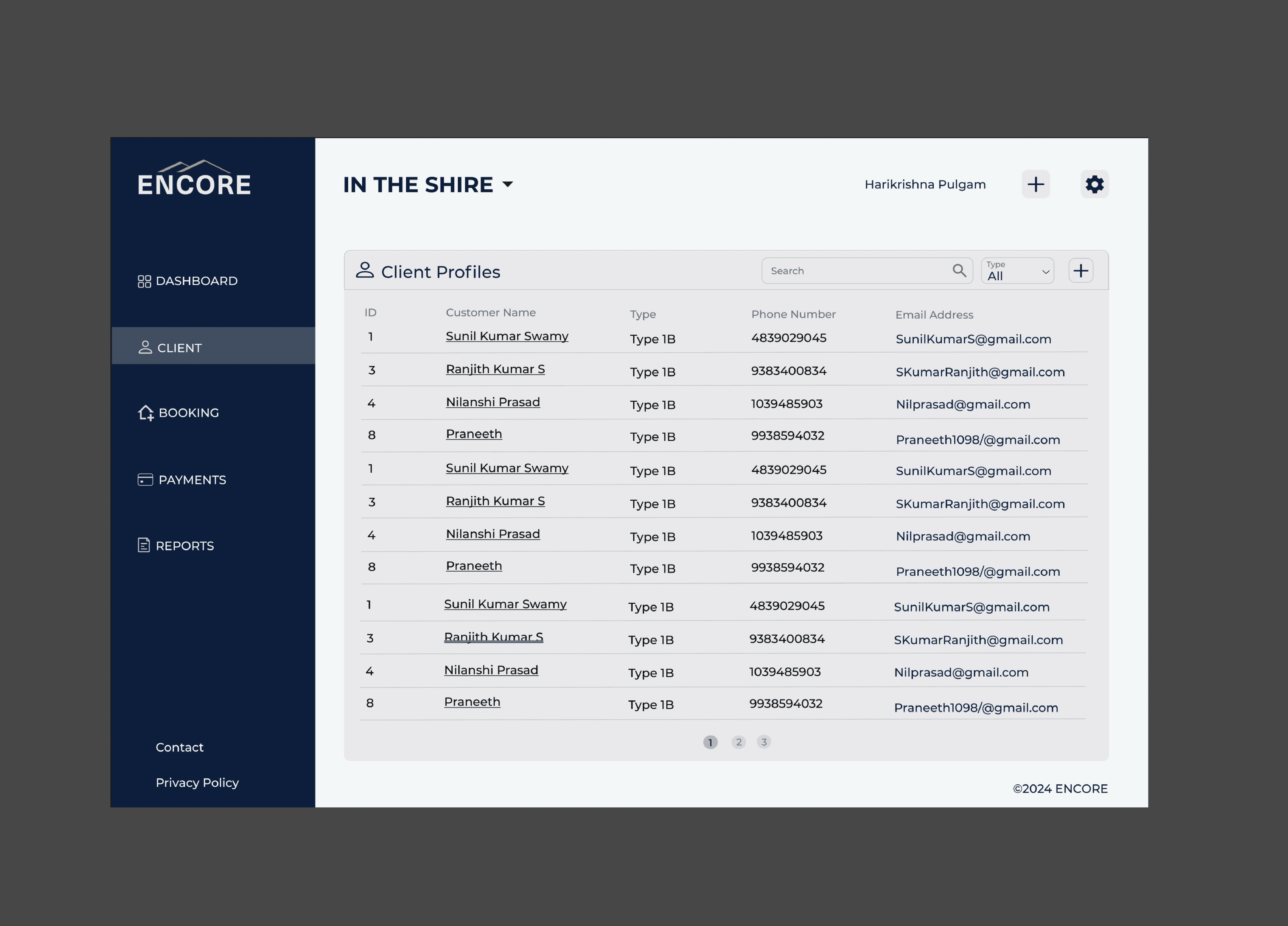
Streamlined Sidebar Navigation: Key areas (Dashboard, Client, Booking, Payments, Reports) were consolidated in a sidebar for easy access.
Enhanced Filtering and Search: Users could filter sales data by sale status and unit type, improving efficiency in locating specific information.

