Fluently: Language Learning Website
Role
UX/UI Designer
Methods & Tools
User Surveys, Competitive Analysis, User Personas, Wireframing, Usability testing, Figma, Miro, User-Centered Design
Duration
January 2023 - March 2023
The challenge was to design a homepage for a fictional online language learning platform, Fluently, that looks professional while appealing to beginner and intermediate language learners. The goal was to create an inviting, easy-to-navigate, and visually engaging homepage that communicates Fluently's key features, encouraging users to explore the platform further.
Problem Statement
Language learning platforms often face challenges in balancing professionalism with approachability, especially for beginners who may feel intimidated. Language Learner’s homepage needed to convey credibility while maintaining an inviting and accessible atmosphere. The homepage had to highlight the platform’s key features and guide users toward exploring further.
Research and Insights
To understand the needs of language learners and create a user-centered design, I conducted research and identified the following insights:
User Surveys: Conducted surveys with beginner and intermediate language learners to understand their preferences and challenges. Key findings included:
Clarity and Simplicity: Beginner learners wanted a homepage that was easy to understand, with minimal jargon and clear instructions.
Encouragement to Explore: Intermediate learners preferred a homepage that highlighted advanced features and benefits of the platform, like interactive exercises and personalization.
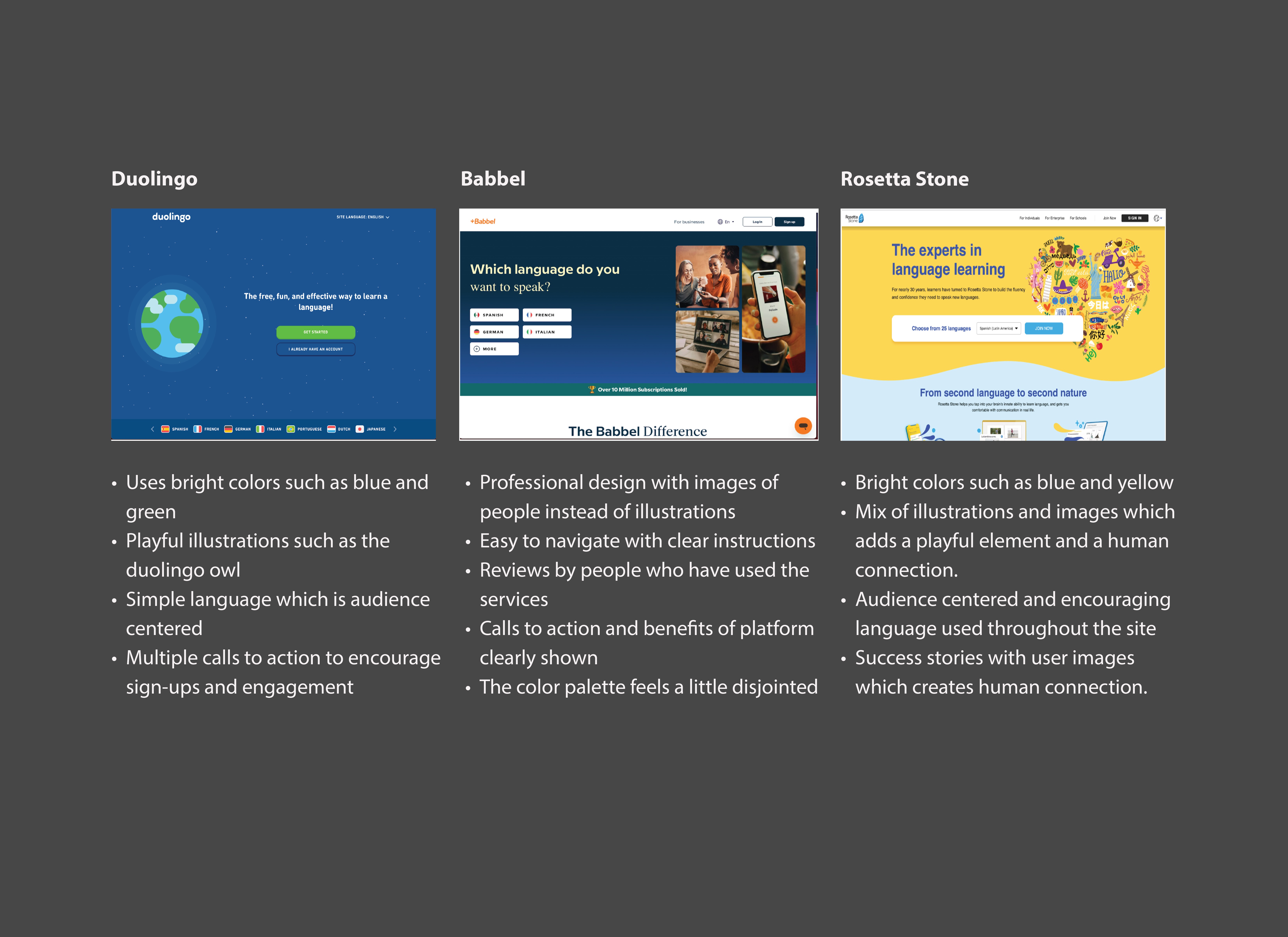
Competitive Analysis: Analyzed competitors such as Duolingo, Babbel, and Rosetta Stone to identify common design elements that resonate with users, as well as opportunities for differentiation.
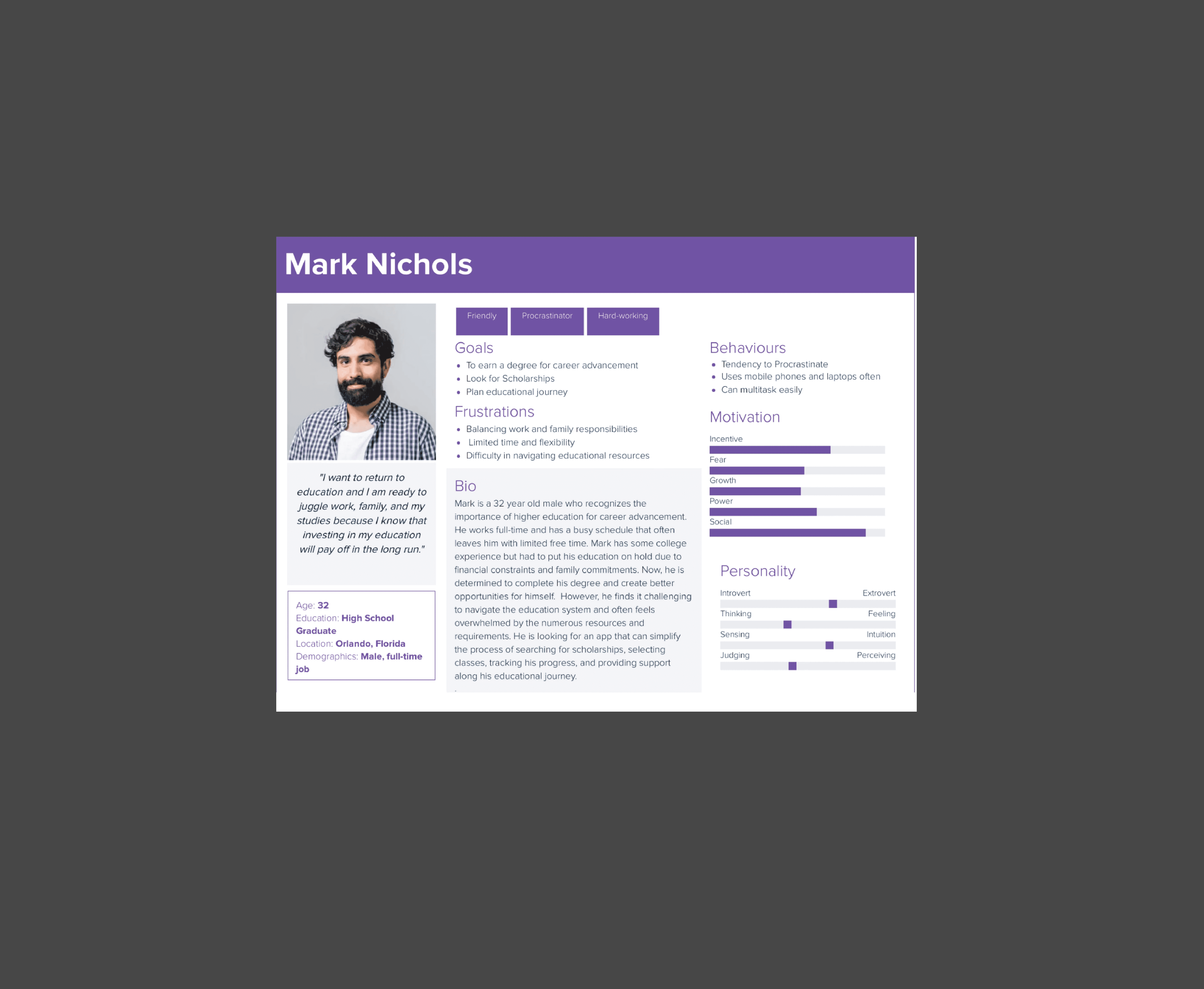
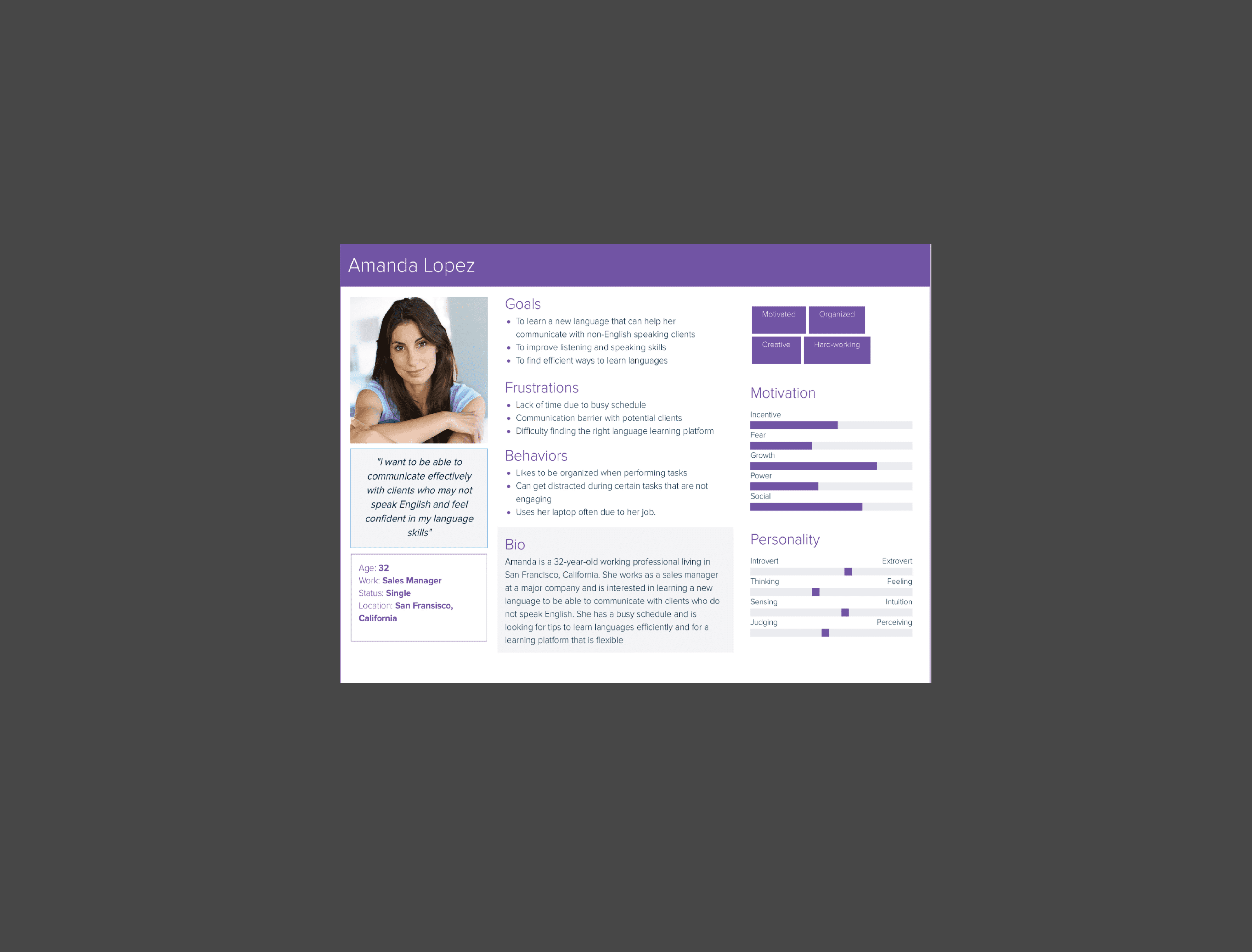
Personas: Developed two primary user personas to guide the design—Beginner Learner and Intermediate Learner—ensuring that the homepage meets the unique needs of both groups.
Key insights included:
Engagement through Visuals: Users responded positively to visuals and icons that represented the language learning journey, as it made the experience feel more enjoyable and accessible.
Clear Navigation: Users wanted a simple, clear navigation that guided them toward signing up, learning about platform features, and exploring language options.
Trust-Building Elements: Users appreciated testimonials, benefits of language learning, and easy access to support and FAQs as trust signals.
Design Process
1. Wireframing & Layout Planning
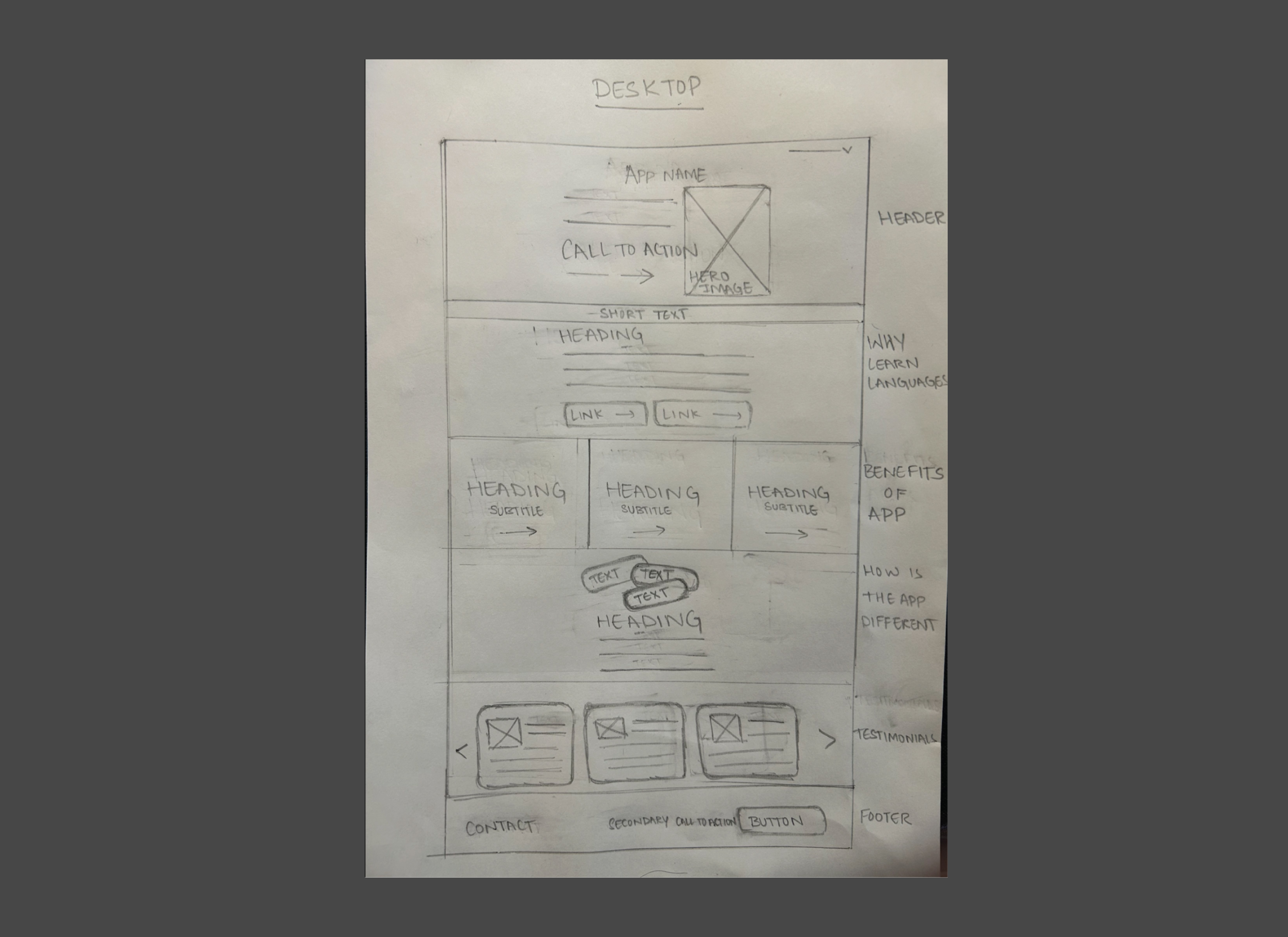
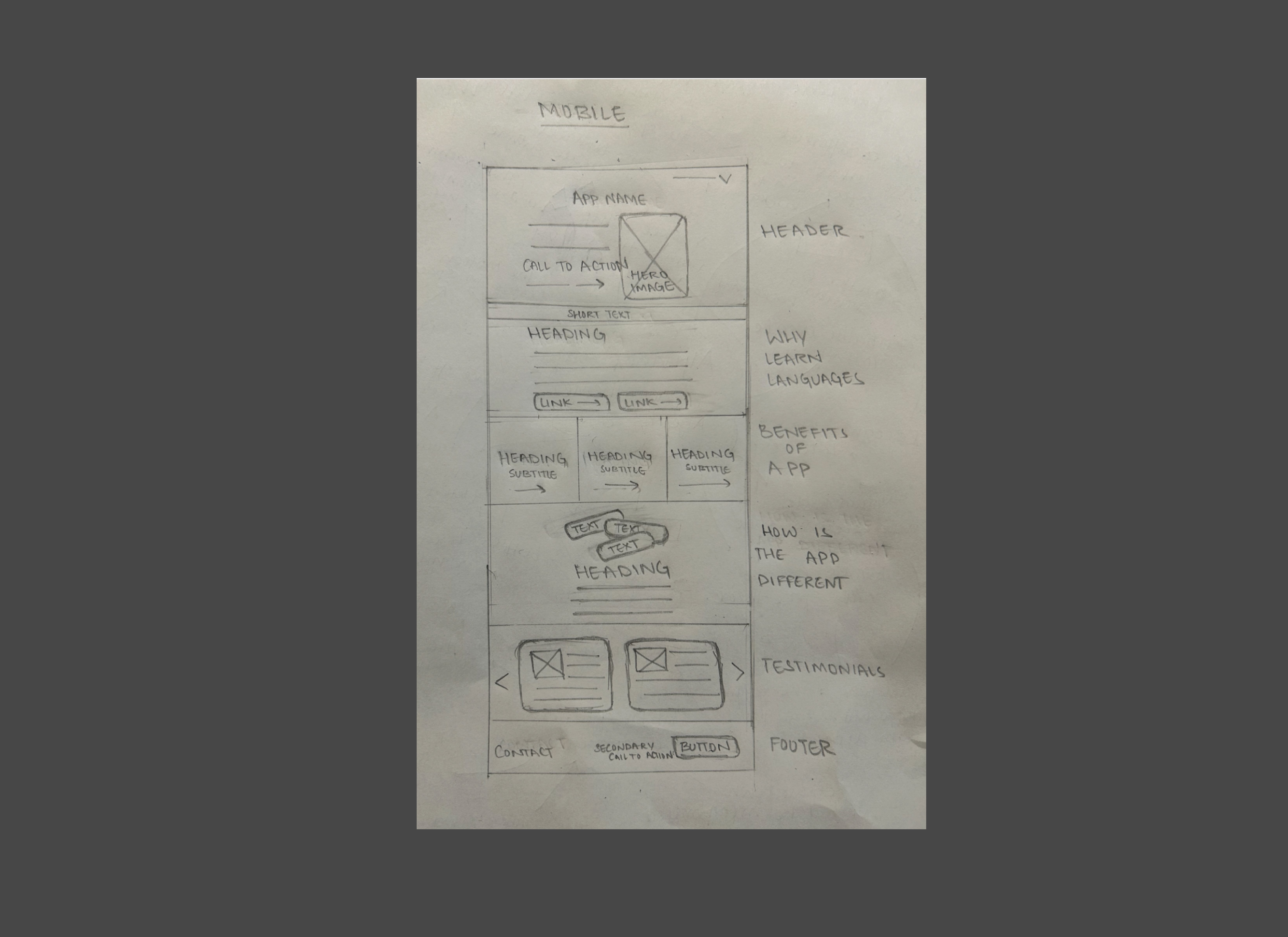
I began with low-fidelity wireframes to outline the structure of the homepage. Key sections included:
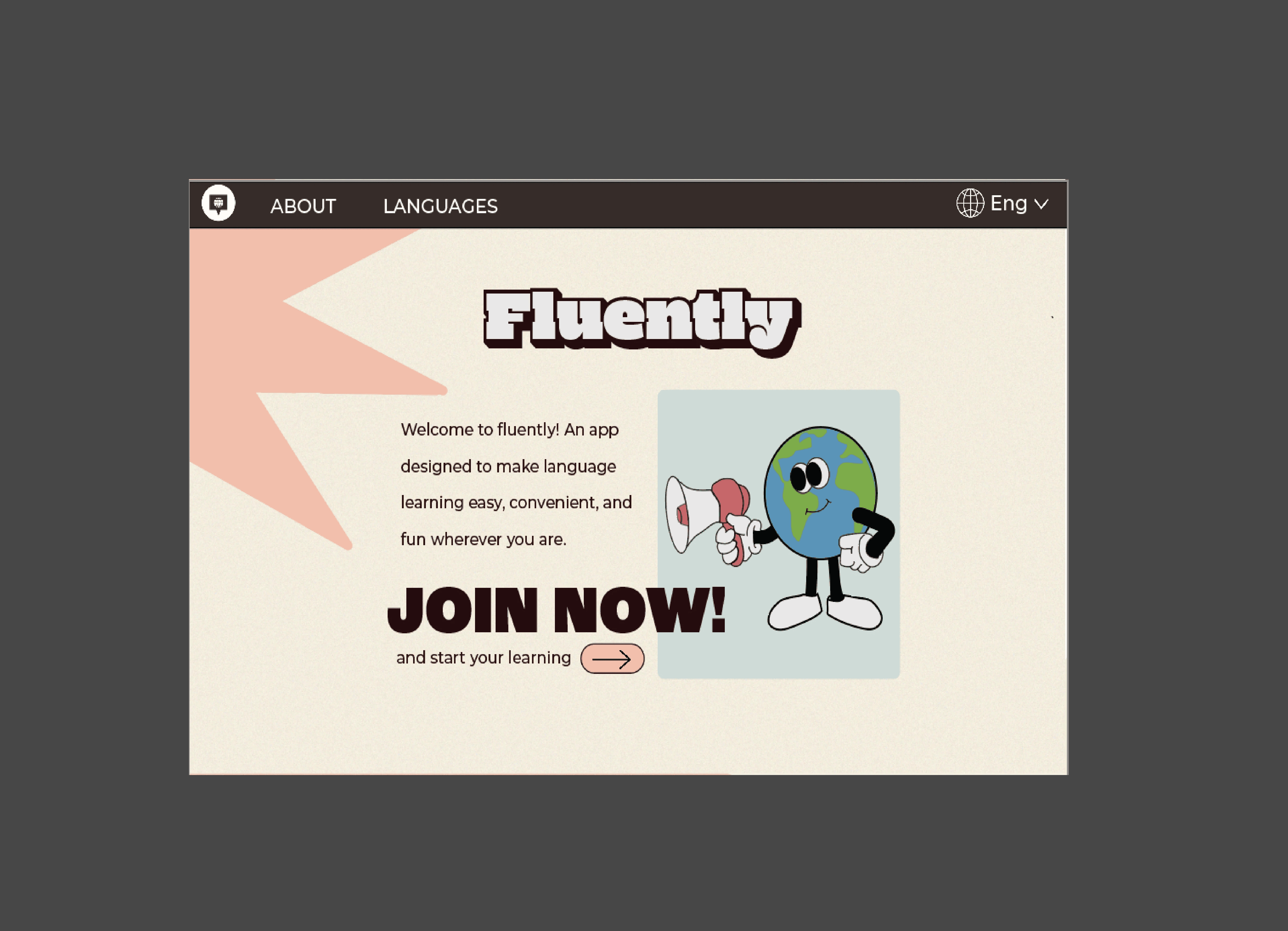
Hero Section: A welcoming message with a call-to-action (CTA) to "Join Now!" that instantly engages visitors.
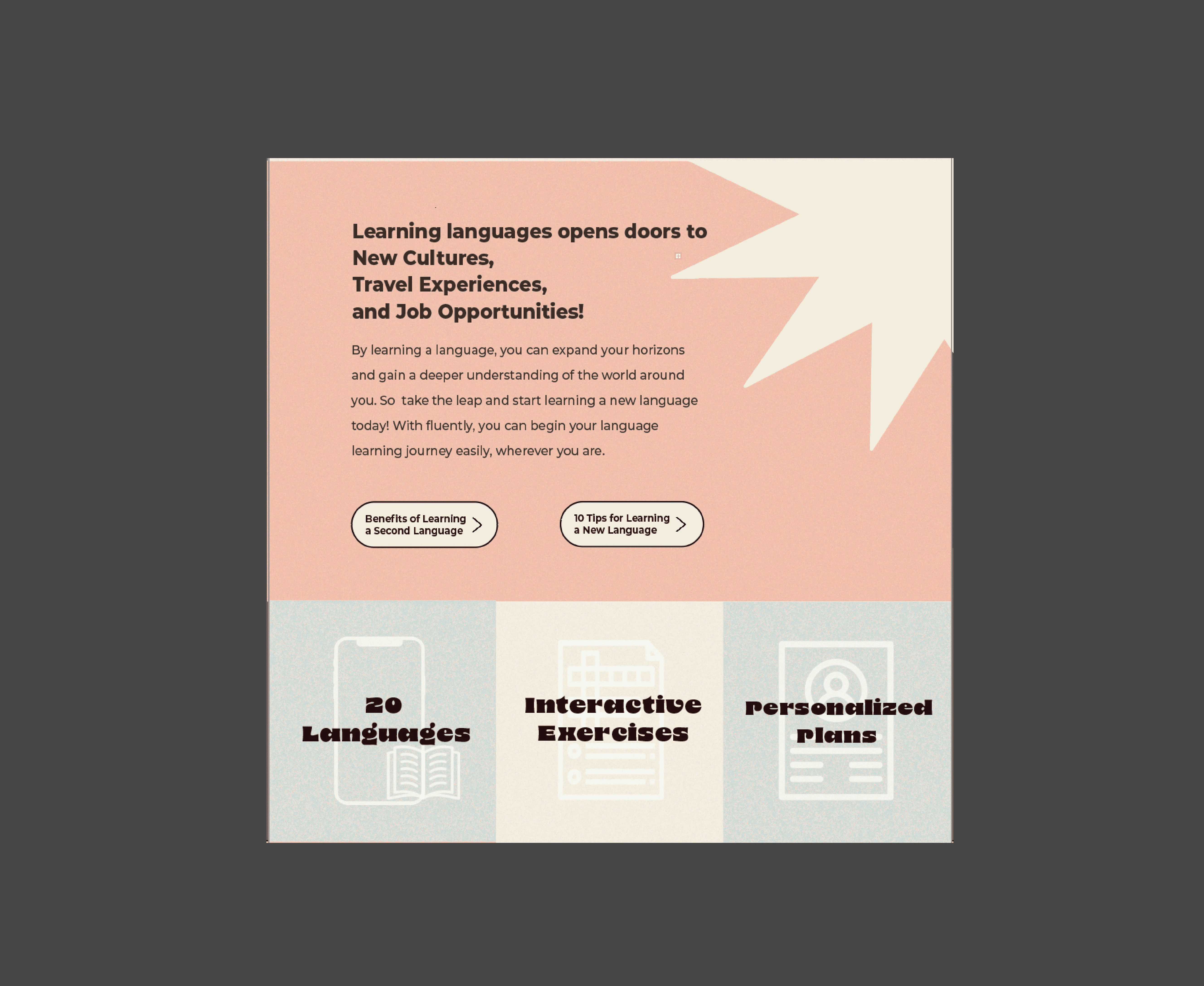
Benefits of Language Learning: A section explaining why learning a new language is valuable, with buttons to explore tips and benefits.
Features Overview: Three main feature cards highlighting "20 Languages," "Interactive Exercises," and "Personalized Plans."
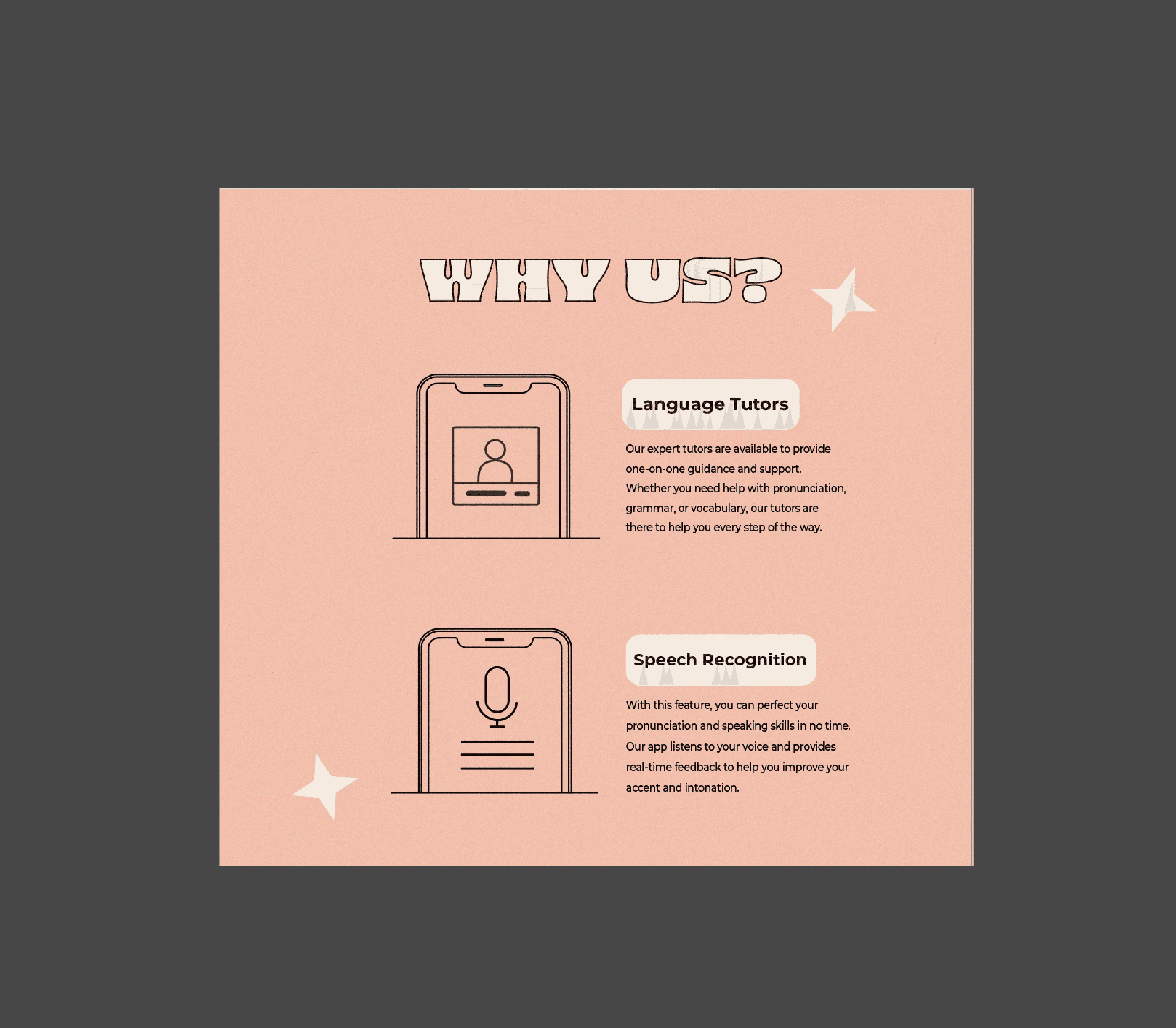
Why Choose Us: A section dedicated to Fluently’s unique features like "Language Tutors" and "Speech Recognition."
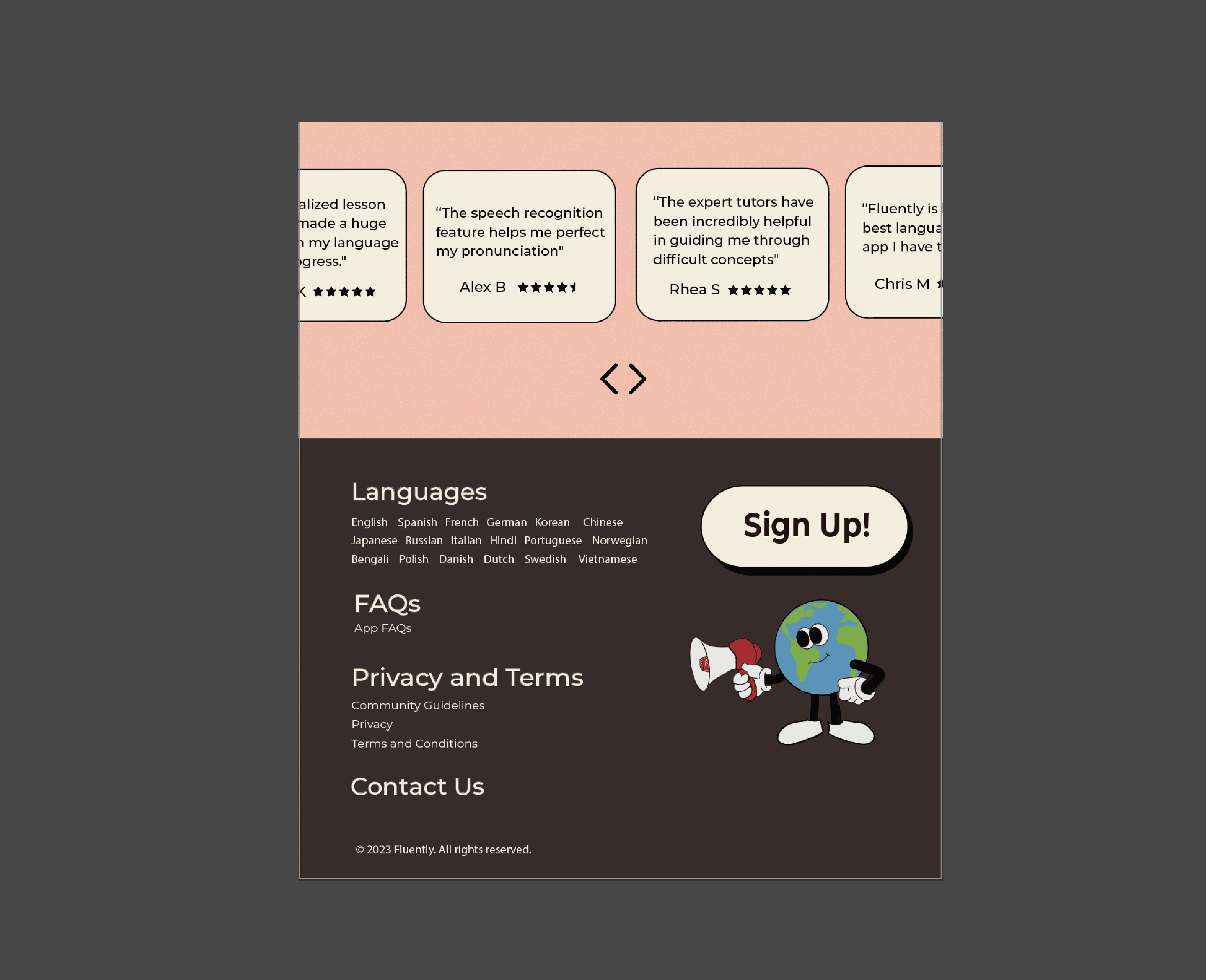
User Testimonials: A carousel of testimonials to build credibility and encourage new users to trust the platform.
Footer: Links to Languages, FAQs, Privacy, Terms, and Contact Us to improve accessibility and offer quick navigation.
2. Visual Design & Prototyping
To create a visually engaging and approachable design, I chose:
Color Scheme: A friendly color palette with soft pastels that feels approachable and welcoming, appealing to both beginner and intermediate learners.
Typography: A bold yet approachable font style for headings to emphasize the fun and inclusive nature of the platform, paired with simple, readable body text.
Icons and Illustrations: Custom icons and a character mascot to visually represent the app’s features and add a playful touch, making the platform feel less intimidating.
3. Usability Testing & Iteration
I developed a high-fidelity prototype in Figma and conducted usability testing sessions. Feedback from beginner and intermediate users was gathered to refine the design:
Positive Feedback on Visuals: Users found the icons and mascot engaging, making the platform feel friendly and motivating.
CTA Clarity: Some users suggested making the "Join Now" button more prominent, leading to slight adjustments in size and color for emphasis.
Desire for Language Options in the Footer: Users wanted to see a quick list of available languages, so a "Languages" section was added to the footer.
Final Design
Based on user feedback and design iterations, the final homepage design included:
Hero Section: A prominent CTA to "Join Now" with the mascot character, creating an inviting start to the homepage.
Benefits of Learning a Language: A brief section on the value of language learning, with easy navigation to explore tips and benefits.
Features Section: Bold icons and short descriptions of key features, allowing users to quickly understand the platform’s offerings.
Why Us Section: Highlights unique selling points like personalized tutoring and speech recognition, providing a sense of professional support.
User Testimonials: A carousel with real-user testimonials, reinforcing the platform's credibility.
Footer: Comprehensive links to languages offered, FAQs, Privacy, Terms, and Contact Us for accessibility.

